
Foreword
A foreword from WTF SEO. Most audits get delivered as a PDF and nobody outside the project ever sees how the thinking happened. For this series we asked working SEOs to run a real audit and think out loud while they do it: what they’re looking at, what they’re looking for, and how they decide what matters. A different auditor each time, a different style each time.
First up is Ioana Sima, who goes by Baabs, auditing xennex.app, an indie software studio here in New Orleans. She had 12 hours and no access to analytics. Everything below is hers.
xennex.app
An indie software studio, audited by Ioana S. for SEO, UX, and messaging.
- Build
- Next.js on Vercel, 61 URLs, one owner
- Scope
- Crawl, structured data, backlinks, SERPs, UX
- Not in scope
- Search Console, GA4, server logs (no access)
- Budget
- 12 hours. Time log at the end.
Where the 12 hours went
- 1hBrowsing as a client
- 2hCrawls, DevTools
- 1hBacklinks, Archive
- 30mSERPs
- 1hStructured data
- 5 to 6hWriting, rechecking claims
Every section below carries one of five tags
- [shipped]Already right.
- [issue]Needs fixing.
- [roadmap]What I’d do first.
- [note]Checked, kept for context.
- [open]Checked, not resolved.
What works
- A fast, server-rendered site that every crawler, AI bots included, can read
- A blog written from real experience, in a real voice
- An estimate calculator that qualifies buyers before they call
What needs fixing
- Nothing tells machines who XenneX is or who writes the blog
- 38 blog posts, each connected to the site by a single link
- Calculator terms and a few small inconsistencies a buyer might notice
What to do first
- Quick wins for trust and conversion
- Make Buddy and the studio recognizable
- Turn the portfolio into case studies that convert
Not in SEO? Read Step 1 for the walk-through, jump to Step 3 for what to do about it, and come back for Step 2 if you’re curious how the checks work.
Whenever I start an SEO audit, the first thing I do is use the site the way a potential client would. I navigate as many pages as I can on both mobile and desktop, fill out forms, click the interactive bits, and write down what I like and don’t from a UX perspective. This is also when I check the robots.txt, XML sitemap, llms.txt (if any), and information architecture. The technical crawl runs in the background while I navigate.
Before I look at anything technical, I try to understand three things, because they decide what “good” means for the website:
- [Q1 · purpose]
What is the purpose of the audit, and of any SEO work that would follow it?
- [Q2 · capacity]
What is realistically possible for the owner to do? In this case, a one-man team working nights and weekends.
- [Q3 · philosophy]
What is the philosophy behind the product and the business?
For me UX > SEO, always. Any SEO choice should support the main goal and the owner’s budget and time. I would not expect a small studio to gain hundreds of links or fix thousands of image alt texts, so everything below is prioritized by impact. One spoiler before the critique starts: one person built this site at night and got the fundamentals right, the blog has a real voice, and the estimate calculator is a smart idea. Most of what follows is about getting the site to show the quality of the work behind it.
First impressions
The stack and the history [note]
A well-built modern studio site
Nothing unusual at first glance. A quick look at BuiltWith confirms the core stack: Next.js on Vercel, a modern setup geared toward speed and static delivery. BuiltWith also surfaces security headers and email-related DNS records, which offer a few clues about how the site is configured and maintained.
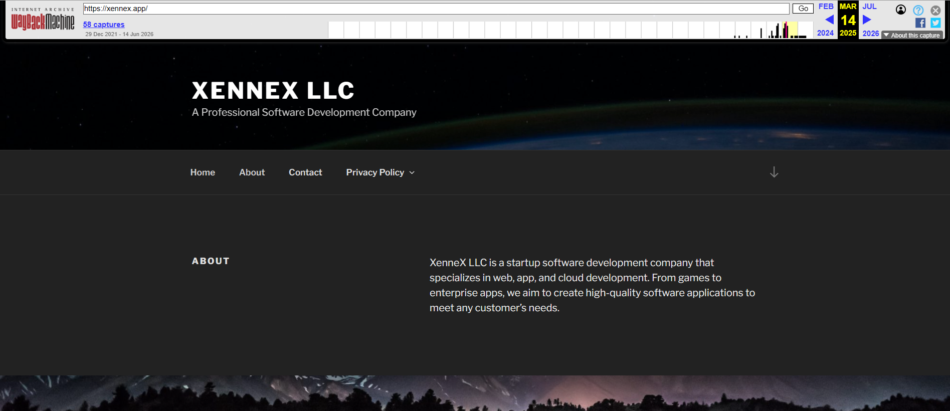
The older technologies are also visible (WordPress with the Twenty Seventeen theme), and a quick Archive.org check confirms the old layout of the site, a very simple default WP template. The current version is a clear upgrade.
The visuals [note]
Imagery doesn’t match the positioning yet
The images seem a mix of stock and AI-generation, and while that’s not a problem in itself, the imagery doesn’t yet match the premium positioning. Noting it down, since the ICP description leans towards premium customers who are explicitly not shopping on price.
There is also a lack of consistency between image types, especially comparing the service pages to the blog. For the builds being showcased, it would look better and more credible if at least the logo or pieces of actual software were shown.
Navigation and structure [issue]
It’s easy to understand what’s being offered. Two things stood out:
/work and /products overlap heavily
Products is a subset of Work (same product cards and archive). /products is only linked from the footer, /work from the top navigation. I would consolidate these onto one page, especially considering that /services also exists.
Privacy policies in the header navigation
I understand why the privacy policies sit on the xennex.app domain (app store requirements, the LLC as the data controller, API/OAuth verification, and the fact that some products don’t have full websites) and there is a mild SEO side-effect in keeping them there. However, eight privacy policies as a top-level dropdown is unusual. A visitor evaluating the studio for services doesn’t need them in the main navigation. Keep the pages and move them to the footer.
Homepage and About pages [issue]
It speaks to a different reader than the one he wants
The language of the homepage is fine. Five consumer apps and a download count tell a COO that he can ship. What she wants to know is whether he has built for a company like hers, and whether he’s set up to support her build for the long haul. The client work and the ownership promise answer both, but they sit below the products.
Homepages are the hardest pages to get right, and this one deserves a proper messaging breakdown, not two paragraphs in a technical audit. I’ll resist. The short version is in Step 3.
A question buyers will ask: capacity
On the About page, the owner says he runs XenneX by night and weekend, and the newest blog post talks about trying to hire and going back to being a solo operator. The site proposes $15K-$75K projects to companies of 50-500 employees, and a buyer at that budget will naturally wonder about capacity. I’d answer it directly on the site: how many projects run at once, what the timeline looks like, and what happens if he’s unavailable. Being a solo senior operator is a selling point for this ICP, as long as the site says how it works.
The Work page [issue]
This page acts like a portfolio, which is great. Let’s explore it:
The owned products show range
Consumer apps, a deal aggregator, a stock-alert service.
Built for others (client work)
They look good overall. Two of them, the Buddy Delaune site and Nion Lights (which he co-owns), would fit better in the owned section, so this list is purely client work. Martin Construction, Mindful Solutions NOLA, and Davadi are the three pieces of work that match the ICP most closely, and right now they sit below the consumer apps. I’d move them up.
The Archive of retired products
It offers very little information. It would be more useful to be able to explore a page explaining what these products were and why they were retired. A blog post explains this in part, but my recommendation would be to restructure this section.
Product cards and client projects link off-site
I don’t recommend this, even though it feels natural, because people will leave the site without having a chance to convert. I would also create dedicated showcase pages for each project, with explanations of how they were built, unique CTAs, then link out.
The portfolio sends buyers off-site
/work, product and client cards
- What I found
- Every card links off-site, the three client projects that match the ICP sit below the consumer apps, and the Archive is cards without a story yet.
- Why it matters
- The strongest evidence on the site leaves the visitor on another domain before they can convert.
- What I’d do
- Case-study pages for Martin Construction, Mindful Solutions NOLA and Davadi (decision, constraints, what was built, what happened), link out from there, and merge /work with /products.
- Owner
- XenneX, with client permission for the case studies.
Small inconsistencies a buyer might notice [issue]
All quick fixes
- Game Night appears on
/workas “Built & owned by XenneX” and again further down on the same page as “Built for others.” - The hero says “consumer apps with hundreds of thousands of downloads,” while the portfolio as shown has one app at 100K+. I’d either tighten the wording to match or name the apps behind the number.
- The website service page estimate starts at $1.5K, while his ideal-client brief sets the floor at $3K. I’d bring the page in line with the clients he wants.
- The Website service’s FAQ “Will the site rank on Google or show up in AI overviews?” answers Yes. Nobody can fully control rankings, so I’d rephrase this around what he does control: the work done right and reported on honestly. That answer also tends to attract the right kind of client, rather than price shoppers.
The offer and the ICP don’t quite line up
/services/website, calculator floor and FAQ
- What I found
- The calculator starts at $1.5K while his ideal-client brief sets a $3K floor, and the Website FAQ answers “Will the site rank on Google?” with Yes.
- Why it matters
- Both can draw in buyers outside his ideal-client profile: price shoppers and people expecting a ranking guarantee.
- What I’d do
- Raise the floor to $3K and rewrite the FAQ answer around what he can commit to: work done right and reported on honestly.
- Owner
- Business decision. Implementation takes minutes.
The blog [issue]
The images
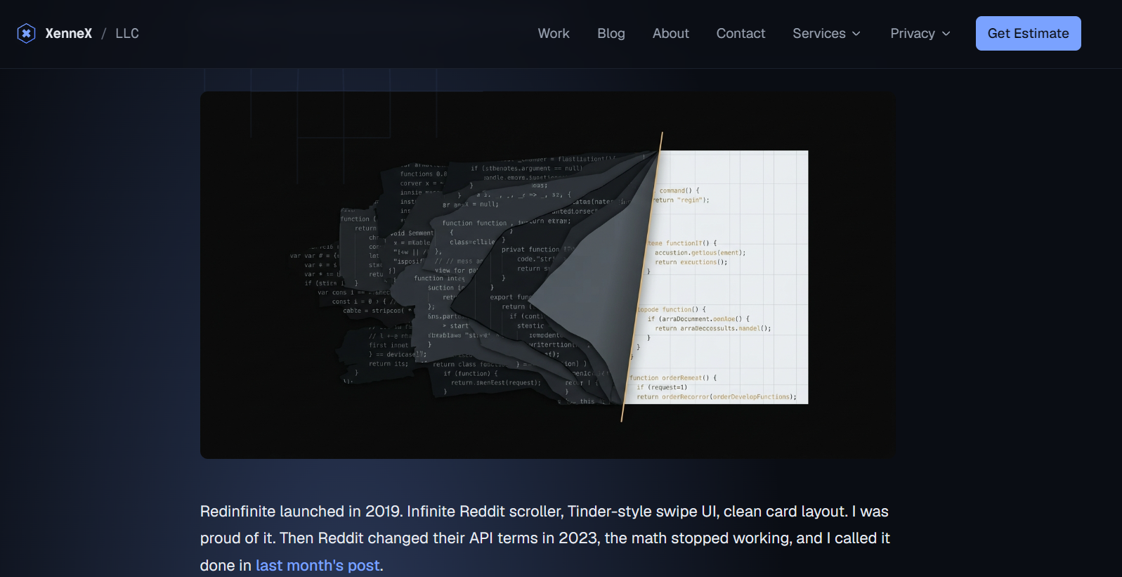
The first thing I notice is the images. Considering all the articles are written in the owner’s own voice, I would have loved to see something more real or at least a consistent style. A good example of what works is “The year I stopped patching and started rebuilding.”
The voice, and what only he could write
Overall the tone of the blog is good, and it has “information gain” elements (things you can only learn from someone who did the work). It’s clearly written from experience, but there is a missed opportunity. In the ICP document, the owner mentions: “You get senior-level thinking on architecture and a single person who speaks both business and engineering. That combination is harder to find than people think, especially at a boutique price point.” That is rare, and the blog is the place to prove it: more in-depth, honest, specific pieces about exactly those decisions.
Topics for the buyer he wants to reach
I also think some of the articles are written more for fellow builders than for the buyer he wants to reach. Some of them are good indie-hacker content, but a $30M-revenue COO evaluating a $50K build wants to know how to scope a build, what “you own the code” actually means in a contract, how to make a build-vs-buy decision, why cheap freelancer work fails, etc.
No byline, and the CTA points home
The posts have no author or byline connecting the “I” to Buddy Delaune, and the CTA at the bottom of each post links to the homepage rather than to /contact or /estimate. For a site whose realistic play is personal brand and E-E-A-T (Google’s shorthand for experience, expertise, authority and trust, which increasingly ties to a named person), the missing byline is the bigger issue.
In my opinion, the ICP for this service doesn’t use regular conversion paths. They read thought-leadership pieces and follow specialists on platforms like LinkedIn and X. More on this in Step 3.
No author on the blog posts
/blog, every post, plus the missing schema
- What I found
- Every post is written as “I” with no byline, and there is no Person or Organization schema tying the writing to Buddy Delaune or XenneX.
- Why it matters
- The realistic strategy is personal brand. Right now the reader and the crawler have a hard time connecting the writing to the person selling the service.
- What I’d do
- A visible byline linking to About, Person and Organization schema with linked @ids and sameAs, and BlogPosting with author on every post.
- Owner
- XenneX. Website work only, no business decision needed.
The estimate calculator (CRO) [issue]
A calculator that qualifies buyers
I like this calculator. It’s easy to see roughly what a project would cost without reaching out, and it’s also a good way for the owner to disqualify clients who aren’t willing to pay. What I’m looking for: can a buyer tell what they’re actually committing to, whether the questions change with the service, or whether every path asks the same things. There are some issues with it though.
Pricing calculator ambiguity
/estimate, one-time vs annual comparison screen
- What I found
- The one-time and annual options don’t say whether the scope is the same, what the monthly fee covers after month 12, or how “own it outright” differs from “code is yours.”
- Why it matters
- A prospective client may misunderstand the financial commitment or lose confidence in the offer.
- What I’d do
- Clarify the pricing model, ownership, minimum term, included support, and cancellation conditions, at the point where the comparison appears.
- Owner
- XenneX, as a business decision first. Website implementation afterward.
The detail behind that ticket
For example, website / standard / needs design / flexible calculation says $8K-$24K one-time and $299-$659/mo. The cheapest one-time version is less expensive than the most expensive monthly option over a year. My first thought is: what happens in month 13? Why the price difference? Is it about who owns the code (the calculator labels one option ‘Full source code, own it outright’ and the other ‘Code is yours’, which sound like the same thing) or how long it takes to develop? I would either want answers to these questions, or clearer explanations of minimum term, total commitment, included work, cancellation, ownership, and post-launch costs at the point where the comparison appears.
The pricing article describes ongoing support as a retainer separate from the build contract. That makes it particularly important to say whether the calculator’s monthly figure is support, a financed build, or something else. I doubt any of this is intentional; it just isn’t spelled out yet. These are suggestions and ultimately depend on the owner. A premium client might prefer to discuss these details in a call, and that’s a legitimate choice.
Two smaller calculator notes
- The one-time / monthly / show-me-both toggle only highlights one column. I’d remove it unless the choice is sent along with the contact form.
- On the advisory path, the steps are nearly identical to other paths. The advisory should have its own qualifying questions, and each service type might benefit from unique qualifying questions.
Digging deeper (the SEO side)
Technical SEO should make the website easier to crawl, understand, and trust. It should not become a project that distracts from improving the offer, proof, and conversion experience.
Based on all the info collected so far, my hunch is that the site is still a work in progress and is written for brand, not search demand. Whether that’s a problem or a direction depends on the owner.
The website says “AI search-ready websites built to rank in Google, AI overviews, and beyond.” That’s a fun invitation: a potential customer may well check xennex.app against its own pitch, so I did the same: structured data, semantic headings, robots.txt, sitemap, speed, and so on. Here’s what I found.
What’s already right [shipped]
- Every page is server-rendered: the full content is in the HTML, not assembled by JavaScript afterwards
- The XML sitemap matches the crawl. 61 pages in, 61 pages out
- Robots.txt is open, and an AI crawler (I crawled as ClaudeBot) gets the same page as a browser
- The on-page images are already served as WebP through Next’s image component (20-50KB each)
- Mobile performance is excellent on lab tests
- The fonts are self-hosted and preloaded
- GA4 is installed and loaded in a way that doesn’t slow the page
- The navigation dropdowns are real HTML (details/summary) so the links exist for crawlers and humans
- Vercel Analytics is installed next to GA4
One person built this at night, on a modern stack, and got the fundamentals right. Everything else in this section is polish and positioning.
Readable by anything that asks
sitewide, crawl, robots.txt, sitemap, rendering
- What I found
- Every page is server-rendered, robots.txt is open, crawls identifying as ClaudeBot and ChatGPT-User get the same HTML a browser does, and the sitemap matches the crawl: 61 in, 61 out.
- Why it matters
- Googlebot and AI crawlers read exactly what a human reads, with no JavaScript to run and nothing to guess at. For a site that sells AI-search-ready builds, this is a great display of skill.
Crawl and indexability [issue]
For the technical side I almost always start with Google Search Console as my source of truth and correlate it with Screaming Frog (a desktop crawler that visits every page like Google would and reports what it finds). I don’t have access to GSC here, so the crawl carries most of my decisions. Overall, there are no huge issues, only some things to note.
How I crawled it
I ran two crawls, each answering a different question:
- A standard crawl with JavaScript on, using Screaming Frog’s own user agent. Baseline. Every URL came back 200, one 404 aside.
- A JavaScript-off crawl identifying as ClaudeBot, pulling structured data and rich-result validation. This tells me what an AI crawler sees without running any scripts and whether the page’s meaning lives in the HTML.
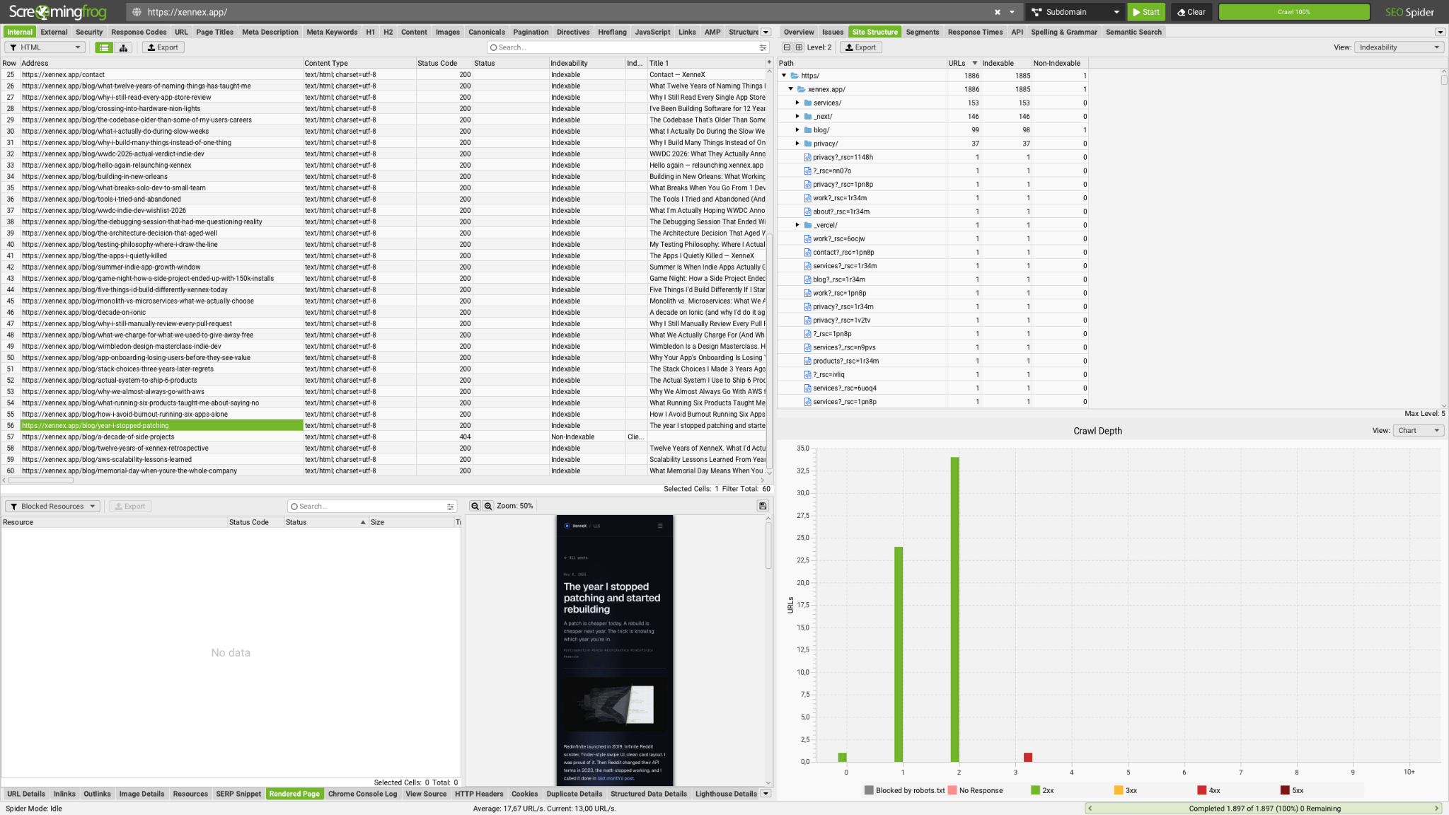
61 pages, 38 of them blog posts
The XML sitemap contains exactly these 61 URLs.
One 404 page
/blog/a-decade-of-side-projects sits three clicks deep with a single inlink from one blog post. Fix the link or redirect it to the twelve-years retrospective.
www and non-www handling
All URL variants (www, non-www, etc.) end up on https://xennex.app, which is what matters. The www redirect is a 307 (a temporary redirect and Vercel’s default). I’d switch it to 308 to consolidate permanently.
Canonicals are missing on every page
Even self-referencing ones. A canonical is a tag that tells Google which URL is the official one when several could serve the same content. On a 61-page site with no URL parameters this isn’t a huge issue, but I recommend adding self-referencing canonicals.
Titles and descriptions
26 of the 38 blog titles run past 60 characters, partly because every title carries the brand name, a suffix that Google often truncates anyway. 31 meta descriptions exceed 160 characters. Meta descriptions do not affect rankings, but persuasive ones can increase CTR. Both minor issues.
Headings
The hierarchy is mostly right, but on /work it’s inconsistent within the same page: product cards use H3 under the section H2, client-work cards use H2 for each project name, and the archive goes back to H3. On the semantic side, the headings are written for humans, which I like, but the H1s on the homepage (Software, shipped) and contact page (Let’s build something) don’t say a lot about what the studio does or where.
AI crawlers and agentic browsing [shipped]
Open to every bot
Robots.txt allows all user agents (User-Agent: *, Allow: /) and points to the sitemap. The ClaudeBot-identified crawl returned 200 on every page with the same content a normal browser sees.
No llms.txt, which is fine
llms.txt can be useful but it’s not a recognized web standard for AI citations, although Chrome’s Lighthouse tool now checks for it.
Internal linking [issue]
The writing is connected only through navigation
The crawl makes the internal linking issue concrete. The core pages (services, about, work, contact, estimate) each get about 60 internal links, because they’re in the header and footer of every page.
However, each of the 38 blog posts has exactly one contextual inlink, from the blog index. Almost no posts link to another post, service page, or client project. So the site’s best asset, the writing, is connected to the rest of the site only through navigation and never contextually.
Performance and tracking [note]
I also spend time in Chrome DevTools while working through the pages, looking at:
Lighthouse on 5 to 10 pages
Different layouts, including throttled to slow 4G. CrUX (Google’s real-user speed data) has nothing at this traffic level, so I’d recheck once real-user data exists.
Network tab
GA4 is installed. I can’t see whether the calculator or contact form send events, so I’d ask for GA4 access before drawing any conclusions about conversion tracking.
The 404 template
It’s Next’s unstyled default. I would recommend a styled 404 page.
Structured data [issue]
Structured data (schema, usually as JSON-LD in the page) is a machine-readable label that says “this is an organization, this is a person, this is an article by that person.” It should reinforce what the visible site already shows; it helps machines understand who’s who, but it doesn’t force them to believe it.
What the validators said
Screaming Frog’s rich-result validation flagged /products with 9 errors and 5 warnings. Google’s own Rich Results Test is gentler and reports five valid SoftwareApplication items with optional fields missing (offers and aggregateRating). Both are right in their own way: the markup is valid, but it won’t produce a rich result because Google requires an offer (a price).
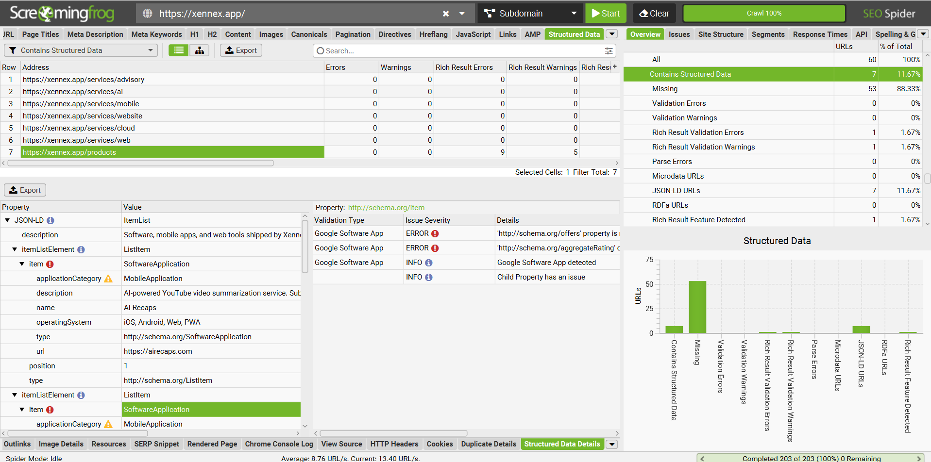
Two things in the markup I’d fix regardless:
Game Night’s reviewCount
The aggregateRating uses reviewCount: 100000. That’s the download count, not the number of reviews. An easy slip to make, but worth correcting, since Google takes inaccurate ratings markup seriously.
Dealery and Redinfinite are categorised as MobileApplication
They are web apps (PWAs).
Nothing says who XenneX is, or who writes the blog
The bigger point is what is missing. Over 80% of pages have no structured data. The only other structured data on the site is FAQPage on the six service pages. There is nothing that tells a search engine or an AI crawler who XenneX is, who Buddy Delaune is, or who writes on the blog.
Organization and Person, linked to each other
Organization and Person, declared once with stable @ids (a fixed identifier each piece of markup can point to) and linked to each other (founder, worksFor), with sameAs listing the other places each of them exists online: buddycdelaune.com, LinkedIn, GitHub, the Apple App Store developer page (for Buddy), and the Clutch profile (for the company).
BlogPosting on every post
BlogPosting with the author pointing at that Person. I would also pair this with a visible byline.
Service on each service page
Service with the provider pointing at the Organization. Useful for describing the service to machines; but don’t expect it to move rankings.
FAQPage can stay
With the caveat that it no longer produces visible rich results for commercial sites.
The @id linking is the infrastructure that creates one entity graph instead of six slightly different descriptions of the same studio.
Social sharing previews [issue]
Shared links render as a gray box
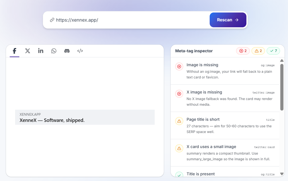
The homepage and service pages do not have og:image (the preview picture social platforms pull when a link is shared) and use the small “summary” Twitter card, and the About page’s og:url points to the homepage. Sharing the homepage and About page on social media would render them as a gray box. Blog posts are set up almost correctly, except for the images that use the .PNG (non-compressed version of the image) in the incorrect ratio.
Organic visibility [note]
Too little data to act on
Third-party tools show very little organic visibility. Without Search Console and analytics access, I cannot establish the actual volume, channel mix, or commercial value of that traffic. A quick Ahrefs check estimates almost 0 organic traffic, 2 keywords, and a DR of 35.
Normally I would check at least 2 more traffic sources (GSC, GA, etc.) but since they are not available I also look at SimilarWeb. 1,700 monthly visitors. SimilarWeb cannot make accurate traffic estimations at lower volume, so I’m not drawing conclusions from it.
Branded SERP [note]
Sharing a name
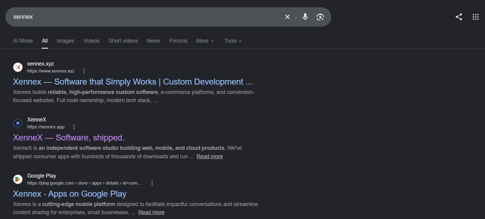
I also check the SERPs for “xennex” and other brand queries to see who we’re going up against. Volume is too low for tool data, so I queried manually (VPN + incognito).
xennex.xyz is the number one result. Very similar name and niche. I couldn’t find any connection between xennex.xyz and xennex.app, so I will assume they are real competitors with high overlap. Not great from a brand perspective, but xennex.xyz has a modest link profile, and it expired while I was writing this, so it should drop out of the results on its own. xennex.app usually comes in second or third, with another app called Xennex showing up in the top three.
Local search [note]
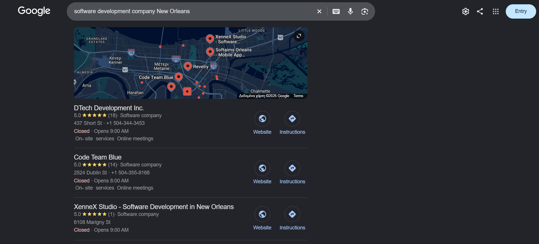
A small disclaimer: I can’t pull SERPs specifically for New Orleans, so this was done through Ahrefs US data plus incognito Google searches on a general US IP.
In the local pack
There is a Google Business Profile with one review and it shows up in the local pack, which is great. There is also a Clutch profile, but with no reviews. Beyond the pack, local volume for these queries is very low and software development isn’t location bound.
The rest of the SERP is ads from large competitors, review aggregators (Clutch, The Manifest), and established local agencies with dozens of reviews, plus a layer of offshore agencies running templated “New Orleans” pages.
Two low-effort actions
Fill out the Google Business Profile properly (including a phone number), and get a handful of real client reviews.
Backlink profile [note]
DR (domain rating) is solid for a studio site of this size, but it’s also the metric I distrust most, so I took a closer look at where it comes from:
The good links
Many of his own products and properties (including vitalinksoftware.com) and app directories like Indus Appstore and mobbo link back to xennex.app.
The spam is not his doing
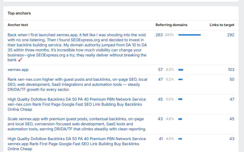
About 90% of the backlink profile is marked as spam by Ahrefs. I checked, and it is. To be clear, none of this is the owner’s doing. Every domain collects this kind of junk unsolicited, and nothing here suggests links were bought or built on purpose.
Where the DR jump came from
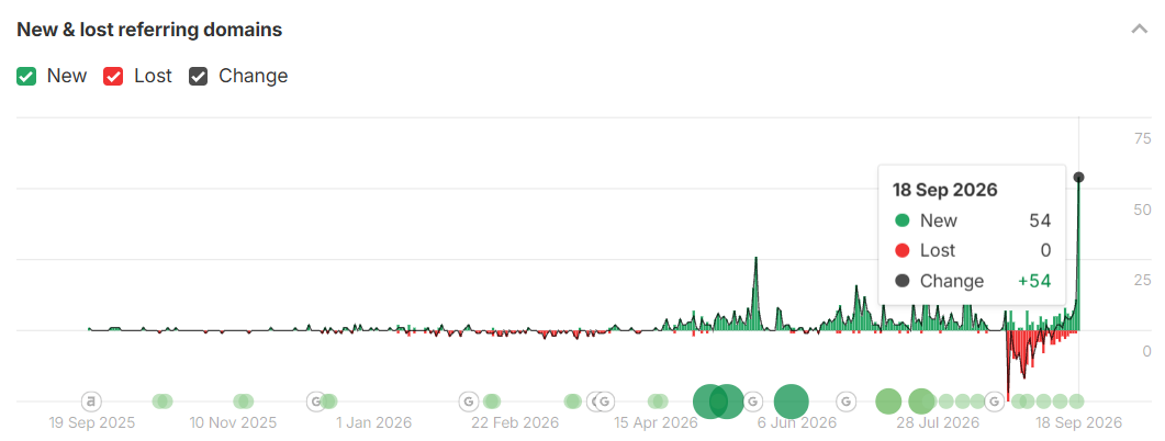
DR plateaued 8-16 prior to 2026 and jumped to 40 in May 2026, and has since slipped back to 35 as those links decay. The jump to 40 seems consistent with a wave of do-follow links from domain-list farms and PBN seller pages: auto-generated pages that link to thousands of domains at once, xennex.app and xen-nex.com among them. Ahrefs counts every do-follow referring domain, so a few hundred of these are enough to move DR even though each individual link is worth close to nothing.
The fabricated testimonials
Alongside these, roughly 300 .store and .shop domains from the SEO Express network carry fake testimonials naming xennex.app. They’re not endorsements of XenneX. They appear to exist for that network’s own benefit, not his.
xen-nex.com
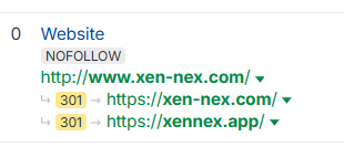
It looks like a brand-variant domain registered in September 2024 that forwarded to xennex.app until recently; Archive.org shows the redirect, Ahrefs still records it, but today the domain doesn’t resolve at all, so the forward has dropped.
I would not disavow
Despite the spam links, I would not create a disavow file (formally telling Google to ignore links). Google is very good at discounting these types of links on its own, and they are already decaying. I would, however, keep an eye on the do-follow farm volume.
What I’d actually prioritize
At this point I have enough information to stop expanding the checklist and start making some decisions. I would not treat every issue equally. My working assumption is that the website should help the right potential client understand the offer, evaluate the studio’s expertise, and make an informed inquiry.
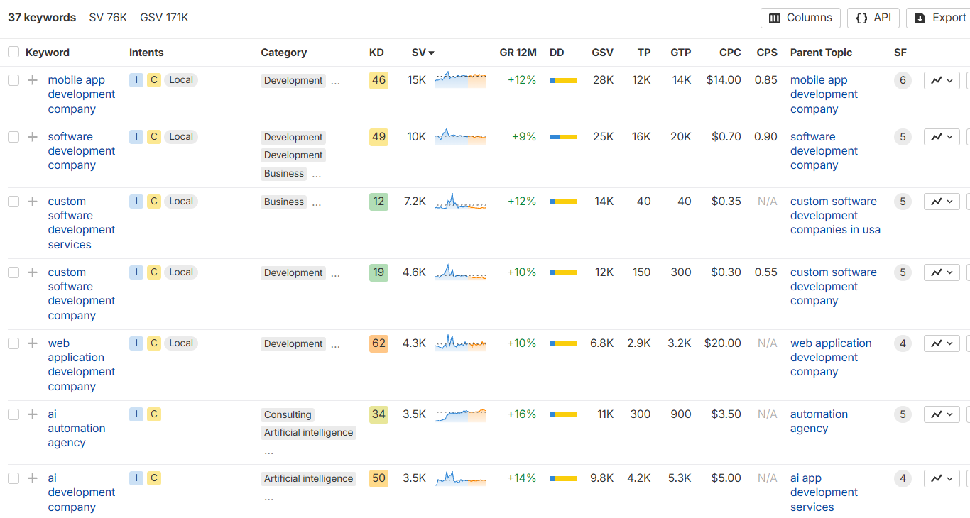
Ranking for ‘custom software development company’ and similar terms isn’t where I’d start. Some keywords are too difficult. Others look easy, but the traffic isn’t there.
They ask a peer, get a name, and look it up.
Bold claim time: his ICP doesn’t search that way. The site’s job isn’t to rank for generic commercial queries. It’s to survive the look-up. Every recommendation below is judged on that.
-
Quick wins for trust and conversion
- Raise the calculator and Website service page floor to $3K
- Clarify calculator commitments and recurring fees
- Change the “Will it rank?” FAQ answer from “Yes” to something he can commit to (e.g. work done right and reported on honestly)
- Tidy up the small inconsistencies mentioned in the first section of this audit
- Address capacity and availability up front
-
Make Buddy and the studio recognizable
- A visible byline on every post, linking to About or buddycdelaune.com
- Implement accurate Organization, Person, and BlogPosting schema
- Get client reviews for the Google Business and Clutch profiles
- Add contextual internal links
- Keep the voice of the blog but change the topics. Do research/social listening to identify the type of questions the ICP has, then write on these topics.
- Create better, more recognizable images and consider adding extra media formats to existing and future blog posts.
-
Turn the portfolio into evidence, strengthen conversion pages
- Create dedicated case-study pages for Martin Construction, Mindful Solutions NOLA, and Davadi. Structure: The decision, The constraints, What was built, What happened. Add CTAs and link out to the live products from here.
- Consolidate
/workand/productsinto one page. Move the strongest projects to the top, and give the Archive a purpose (or cut it). - Test the homepage messaging before rewriting it. A few ways to do that: run a Wynter test with people who match the ICP; read how competitors describe the same offer; do some research into how his buyers actually talk about the problem (forums, LinkedIn, sales calls if he has notes); and put the current page through an AI critique as a fast second opinion.
- Rewrite and restructure the page around the research findings
- Optional: create a “how I work” page that explains the philosophy and building principles of the studio. This page can also answer questions on ownership, minimum term, and what happens during the project.
-
Improve measurement and conversion paths
- Verify that calculator and contact form events reach GA4
- Track which inquiries were actually qualified, even in a spreadsheet
- Improve CTAs across the website
- Ensure case studies lead naturally towards conversion pages
-
Technical SEO cleanup
- Fix the 404 and check the old WordPress URLs redirect
- Add canonical tags as preventative hygiene
- Design a branded 404 page
- Fix the heading hierarchy and make the H1s say what the studio does
- Refine titles and social metadata
Where the real work starts
Twelve hours gets us this far: a crawl analysis, a backlink autopsy, a structured data check, and a lot of clicking around as a pretend COO with a $50K problem. Would I feel confident recommending a conversation with XenneX for the right project? Yes. Would I expect the website to answer more questions before that? Also yes.
The stack is right and the expertise is real. That’s the easy part to say. The harder part is that most of what I found isn’t an SEO problem. It comes down to what the business wants its website to do. Adding canonical tags won’t fix that. I could turn this into a 20-page audit, but in the end it will come down to the same thing.
The actual next step would be a conversation with the owner.
- What should the site do a year from now?
- How many inquiries would change the business?
- How many hours a week are available?
Anyway, that’s it from me. Hope you enjoyed this read! :)
Next release
- Old WordPress URLs through Screaming Frog list mode
- Search Console: real queries, and whether Google agrees with the crawl
- GA4: do the calculator and contact form send events at all
- DR recheck once the farm links finish decaying
Time log, 11 of 12 hours